
CSS Border
The CSS Border property lets you add a line around any HTML element. Borders define visual boundaries and can be styled with different widths, styles (solid, dashed, dotted), colors, and even rounded corners using border-radius.
CSS Border Sub-properties
border-width
Defines the thickness — 1px, thin, medium, thick.
border-style
Defines the style — solid, dashed, dotted, double, groove, ridge, inset, outset.
border-color
Sets the border color using any CSS color value.
border-radius
Rounds the corners — values in px, %, or em.
Side-specific
Use border-top, border-right, border-bottom, border-left.
Shorthand
Combine all in one declaration — border: 2px solid red;.
CSS Border Syntax
selector {
    border-width: 2px;
    border-style: solid;
    border-color: #1a73e8;
}

/* Shorthand */
selector {
    border: 2px solid #1a73e8;
    border-radius: 10px;
}
CSS Borders
In CSS, borders define the visual boundaries of elements on a webpage. Borders can be customized using style, color, and width. They help create clean layouts, highlight content, and improve the overall structure of web design.
Border Style Example
The border-style property defines the style of the border.
Common values include solid, dashed, dotted, double, groove, ridge, inset, and outset.
<html>
<head>
<style>
p{
    text-align:center;
}

h2{
    text-align:center;
}

p.dotted{
    border-style:dotted;
}

p.dashed{
    border-style:dashed;
}

p.solid{
    border-style:solid;
}

p.double{
    border-style:double;
}

p.groove{
    border-style:groove;
}

p.ridge{
    border-style:ridge;
}

p.inset{
    border-style:inset;
}

p.outset{
    border-style:outset;
}

p.none{
    border-style:none;
}

p.hidden{
    border-style:hidden;
}

p.mix{
    border-style:dotted dashed solid double;
}
</style>
</head>

<body>

<h2>The border-style Property</h2>

<p>This property specifies what kind of border to display:</p>

<p class="dotted">Dotted border.</p>
<p class="dashed">Dashed border.</p>
<p class="solid">Solid border.</p>
<p class="double">Double border.</p>
<p class="groove">Groove border.</p>
<p class="ridge">Ridge border.</p>
<p class="inset">Inset border.</p>
<p class="outset">Outset border.</p>
<p class="none">No border.</p>
<p class="hidden">Hidden border.</p>
<p class="mix">Mixed border.</p>

</body>
</html>
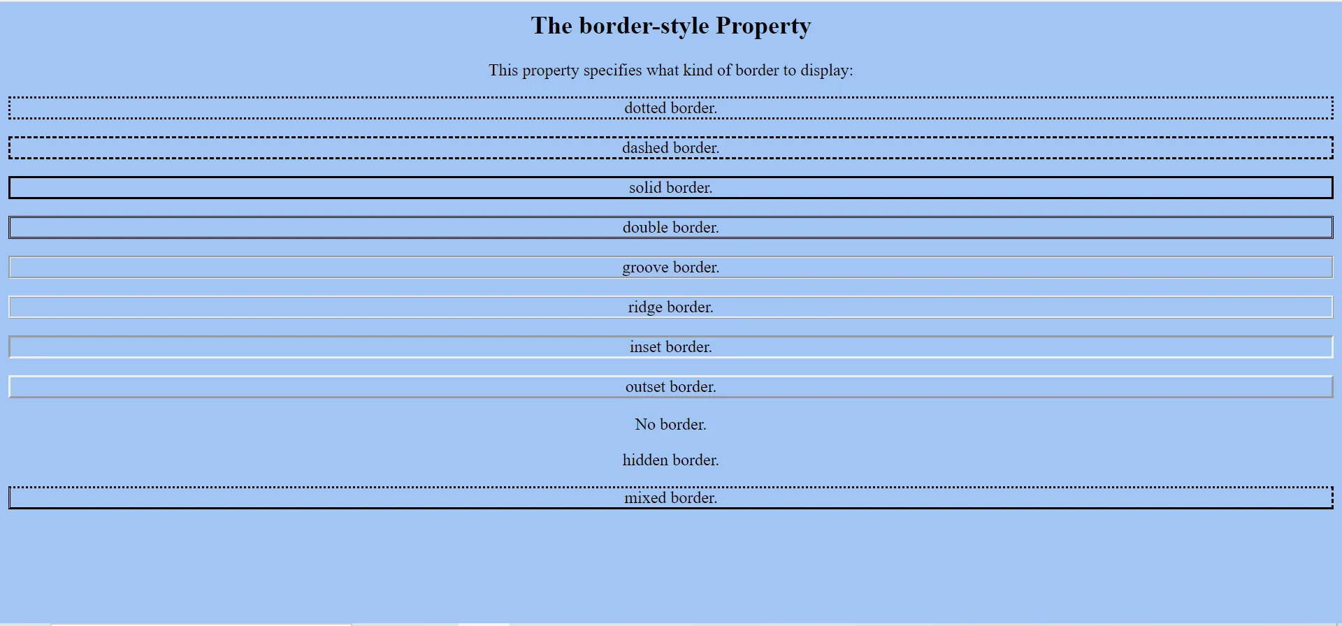
border-style: Defines the type of border.dotted: Creates a dotted border.dashed: Creates a dashed border.solid: Creates a simple solid border.double: Creates a double-line border.
Border Style & Color Example
The border-color property sets the color of borders.
It works only when border-style is already applied.
<html>
<head>
<style>
p.one{
    border-style:solid;
    border-color:red;
}

p.two{
    border-style:solid;
    border-color:green;
}

p.three{
    border-style:solid;
    border-color:red green blue yellow;
}
</style>
</head>

<body>

<h2>The border-color Property</h2>

<p>This property specifies the color of the four borders:</p>

<p class="one">A solid red border</p>
<p class="two">A solid green border</p>
<p class="three">A solid multicolor border</p>

<p>
    <b>Note:</b>
    The border-color property does not work if it is used alone.
    Use border-style first.
</p>

</body>
</html>
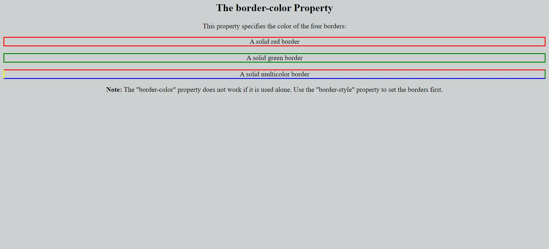
border-color: Sets the color of borders.- Single color: Applies the same color to all sides.
- Multiple colors: Applies different colors to top, right, bottom, and left borders.
- Important: Border color requires a border style to be visible.
Border Property Reference
| Property | Common Values | Description |
|---|---|---|
border-style |
solid / dashed / dotted / double | Defines the border type |
border-color |
red / #000 / rgb() | Sets border color |
border-width |
thin / medium / thick / px | Controls border thickness |
border |
1px solid red | Shorthand for width, style, and color |
Conclusion
CSS borders improve the visual structure of webpages by creating clear boundaries around elements. They are useful for design separation, highlighting content, improving readability, and creating professional layouts.
Border Example
<!DOCTYPE html>
<html>
<head>
    <title>CSS Borders</title>
    <style>
        body {
            background: #fafafa;
            font-family: Arial;
            padding: 20px;
        }
        .box {
            padding: 20px;
            margin: 10px;
            text-align: center;
        }
        .solid    { border: 2px solid #1a73e8; }
        .dashed   { border: 3px dashed #d81b60; }
        .dotted   { border: 3px dotted #4CAF50; }
        .double   { border: 6px double #ff5722; }
        .rounded  { border: 2px solid #6a1b9a; border-radius: 12px; }
        .circle   { border: 2px solid #00838f; border-radius: 50%; width: 100px; height: 100px; margin: auto; }
    </style>
</head>
<body>
    <div class="box solid">Solid Border</div>
    <div class="box dashed">Dashed Border</div>
    <div class="box dotted">Dotted Border</div>
    <div class="box double">Double Border</div>
    <div class="box rounded">Rounded Border</div>
    <div class="box circle">Circle</div>
</body>
</html>
Code Explanation
border: Shorthand for width, style, and color.border-radius: 12px: Adds rounded corners.border-radius: 50%: Creates a perfect circle when width = height.- Side-specific borders: Use
border-top,border-right, etc. to style sides individually.
Border Style Reference
| Style | Appearance | Best Use |
|---|---|---|
solid |
Continuous line | Cards, buttons, inputs |
dashed |
Dashes | Drag-and-drop zones, callouts |
dotted |
Dots | Decorative dividers |
double |
Two parallel lines | Formal headings |
groove |
3D groove effect | Retro look |
ridge |
3D ridge effect | Retro look |
none |
No border | Reset borders |
Border Categories
Full Border
Apply border to all four sides using the shorthand.
Side Borders
Style individual sides — top, right, bottom, left.
Rounded Borders
Use border-radius for soft corners or circles.
Border Property Symbols
Important Notes
- Border adds to width: Borders increase the element size unless
box-sizing: border-boxis used. - Use border-radius carefully: Too much rounding can affect readability of text inside the element.
- Combine with padding: Always pair borders with padding for breathing room.
- Default style is none: If
border-styleis not set, the border will not appear even with width and color set.
Real-World Use Cases
Cards
Solid borders highlight card edges and create separation.
Form Inputs
Borders define input fields and indicate focus states.
Avatars
Use border-radius: 50% for circular profile pictures.
Practice Questions
- Create a 2px solid red border around a div.
- Make a circular avatar using border-radius: 50%.
- Apply only a bottom border to a heading.
- Style a dashed orange border on a button.
- Round only the top-left and top-right corners of a card.
Frequently Asked Questions
- What is the border shorthand:
border: width style color;combines all three properties. - How to make a circle in CSS: Set equal width and height and use
border-radius: 50%. - Why does my border not show: Make sure
border-styleis set — default is none. - How to style each side differently: Use
border-top,border-right,border-bottom,border-left.
Conclusion
CSS borders define visual boundaries and bring structure to every component. By combining width, style, color, and radius, you can create modern, professional designs for cards, buttons, inputs, and avatars.
CSS All Topics
Continue Learning
Previous
Go to CSS Backgrounds Chapter